The Man
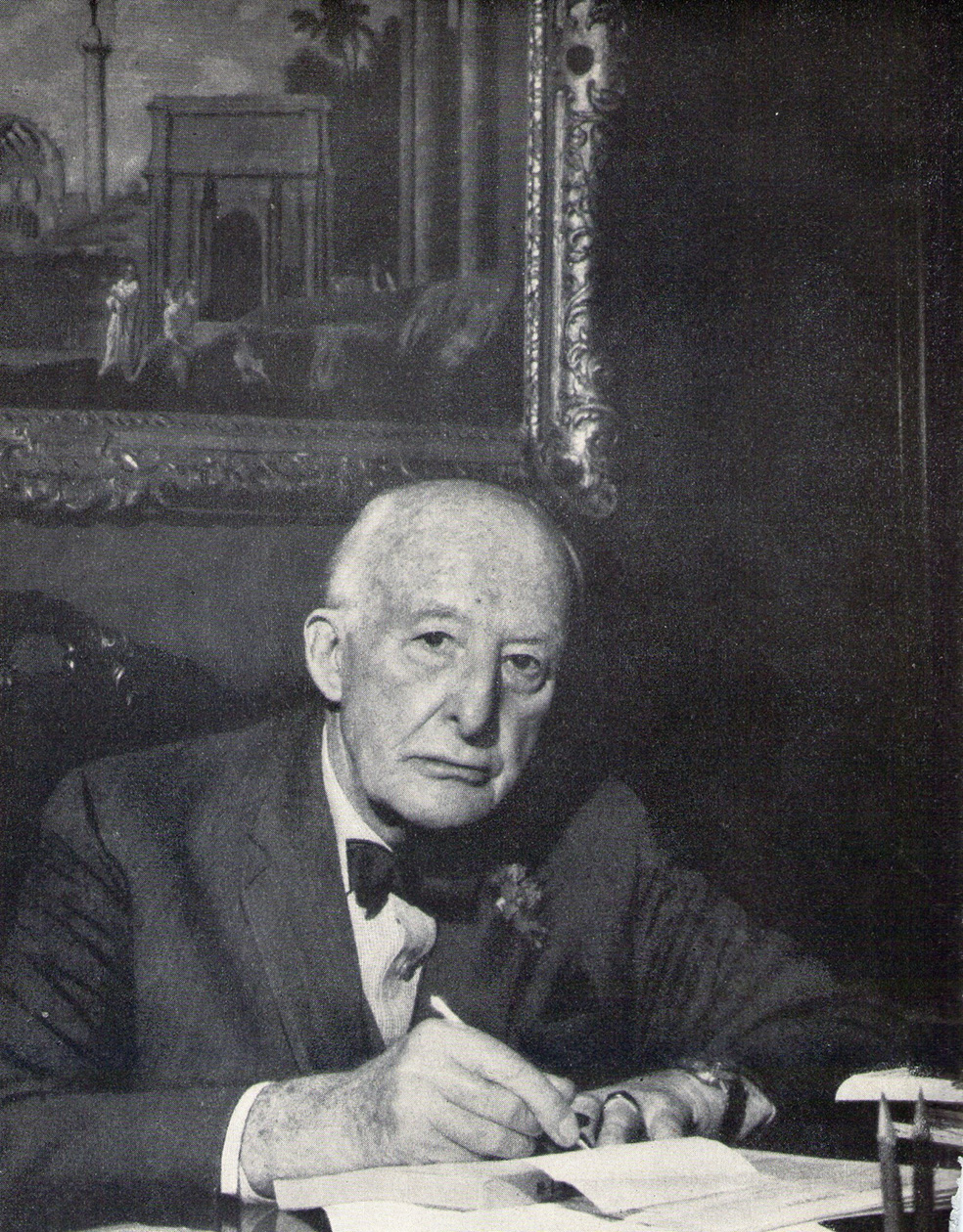
Alejandro Enrique Shaw was a lawyer, banker, publicist, lecturer, member of the National Academy of Economic Sciences, founder of Banco Shaw, and director of major companies, as well as a collector and bibliophile. The son of Alejandro Shaw and María Fynn, he was born in Milan on April 22, 1893. He studied in Winchester, Frankfurt, and Paris, eventually graduating in Law in Buenos Aires in 1916 and earning a doctorate in Law with a thesis on "Bank Rediscounts: Results of the Current Law." He served as a director of the firm Ernesto Tornquist & Co. between 1928 and 1930—representing the company in Europe—and held positions as president and director of various other companies. In 1944, he established Financiera Shaw, which formally became Banco Shaw in 1956—one of the most renowned private banking institutions of the era.
He married Sara Dolores Tornquist [1897–1927] on October 4, 1917, and they were the parents of Alejandro Benjamín [1919–1983] and Enrique Ernesto [1921–1962] [1].
The Art Collection
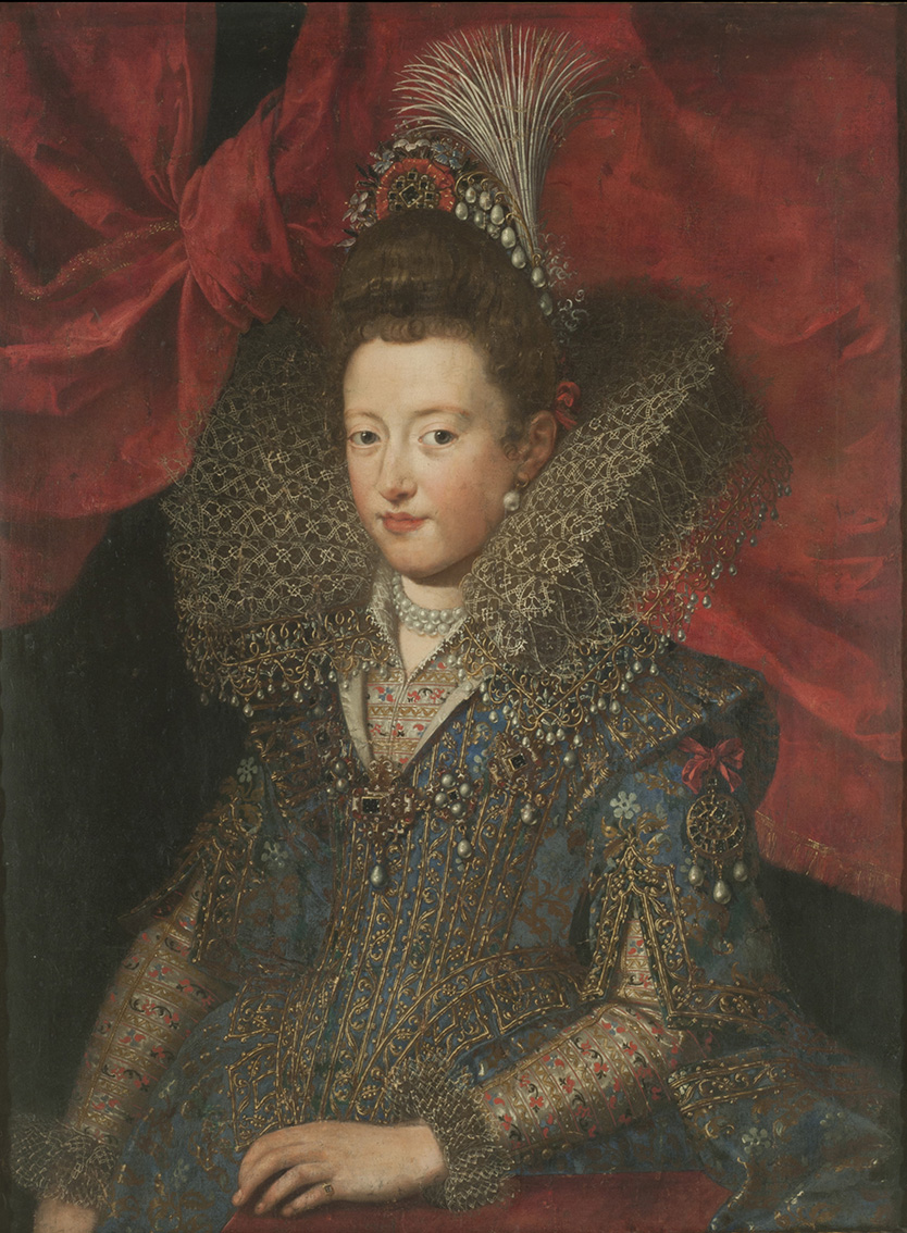
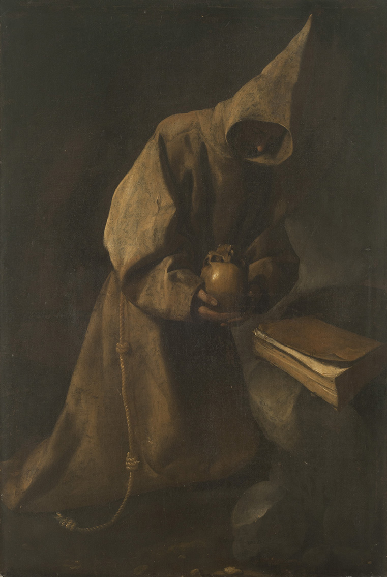
A renowned connoisseur, Alejandro Shaw was distinguished by his refined focus on classical European art, colonial silverware, and Argentine painting, as well as fine porcelain—such as pieces from the East India Company—and high-quality furniture. Among other works, he owned the Flemish oil painting *Portrait of Margherita Gonzaga* by Frans Pourbus the Younger, which was donated to the National Museum of Fine Arts; the masterpiece *Saint Francis in Meditation* [1632] by Francisco de Zurbarán—also from his collection—met the same fate. The "Amateurs-Collectionnaires-Bibliophiles" section of the 1933 *Annuaire de la curiosité des Beaux-Arts et de la Bibliophilie* contains a notice from Alexandre E. Shaw—residing at Charcas 682, Buenos Aires—stating that he collected "Compagnie des Indes" porcelain and paintings of the Spanish School, and was open to receiving offers for new acquisitions [2].
The Library
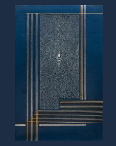
Shaw was also an avid bibliophile who amassed valuable collections of antique French books and rare volumes in the library of his home, located opposite Plaza San Martín. He was a member and president of the *Sociedad de Bibliófilos Argentinos* (Society of Argentine Bibliophiles). He appreciated the fine bookbindings characteristic of the early twentieth century [3]; between 1928 and 1932, he commissioned work from Geneviève de Léotard, a prominent French bookbinder born in 1899 whose output was closely linked to the Art Deco movement. Active in Paris from 1912, she was first a student and later an instructor at the renowned *École de l’Union Centrale des Arts Décoratifs*. She was a pupil of Pierre Legrain—with whom she worked for a time, naturally absorbing his influence as well as that of André Legrand and Mme. René Sergent—and received the Blumenthal Prize in 1927 before ceasing her professional practice in 1939 [4]. Although her name was sometimes overshadowed by the major male-run workshops of the era, her work is highly prized by collectors of modern illustrated books and bibliophiles alike. Her work is characterized by a geometric, avant-garde style; her designs from the late 1920s and 1930s are notable for their use of clean lines, concentric circles, and abstract compositions that reflected the Parisian modernity of the era. She specialized in creating unique artistic bindings for the literature and poetry of her time, employing high-quality leathers and color mosaics—rivaling Rose Adler in elegance, according to Yves Peyré [5]. Julien Fléty notes that her well-constructed bindings—featuring pure decoration and harmonious color palettes—"possess a reasoned originality that consistently secured her top honors at the exhibitions in which she participated" [6].
On Wednesday, November 22, 2017, a public auction was held in the Salon Mogador at the Hotel Ambassador (16 Boulevard Haussmann, Paris) for approximately one hundred editions bound by Geneviève de Léotard; the sale included a set of 21 Art Deco bindings created between 1928 and 1932 for Alejandro E. Shaw [7].
Among these, ten bindings in Jansenist-style Moroccan leather stand out. Regarding the use of materials most emblematic of Art Deco, two bindings are exceptional for their use of snakeskin and shagreen (*galuchat*). The others are notable for the use of China paper and Imperial Japanese paper, as well as vellum (*vélin*) [8].
Let us now examine some of the volumes that belonged to A. Shaw’s library, following the order of the catalog and adding details regarding the type of paper used.
*Chéri*, by Colette [Paris, H. Blanchetière, 1925], quarto format, bound in green Jansenist-style goatskin (*maroquin*). This is a highly luxurious binding style characterized by extreme sobriety and a complete absence of exterior decoration. The term combines the use of *maroquin*—a high-quality, durable goatskin with a visible grain—with an austere aesthetic inspired by the 17th-century Jansenist religious movement, which advocated simplicity and rejected ostentation. Unlike other bindings of the era that relied heavily on gilding and mosaic patterns—such as the *à la dentelle* or Le Gascon styles—the Jansenist style shifts all the richness to the book's interior. Its main features are a smooth, austere exterior where the covers (or boards) are completely unadorned, lacking any engraving, gilding, or ornamentation. The focus is entirely on highlighting the impeccable quality of the leather and the binder's technical perfection. The spine typically displays traditional raised bands from the sewing process but features minimal or no lettering—that is, simple raised bands. Although it appears to be a modest book from the outside, opening it reveals its true value and hidden luxury. It commonly features leather doublures (leather-lined inner covers), silk endpapers, and an interior *dentelle* (fine, gold-tooled lace-like patterns along the inner edge of the covers). Ultimately, this style demands extreme technical precision; without exterior gold decoration to mask imperfections, the execution of the edge-trimming, leather skiving, and squaring of the boards must be absolutely flawless. This edition is illustrated with 21 drypoints by Lobel-Riche, accompanied by tailpieces and decorative motifs designed by Henri Blanchetière; it is one of 40 copies printed on Imperial Japanese paper from a total edition of 275.
*En suivant la Seine...* by Gustave Coquiot [Paris, André Delpeuch, 1926], octavo format; first edition illustrated with 41 full-page black-and-white compositions by Pierre Bonnard, Marc Chagall, André Derain, Raoul Dufy, Marie Laurencin, Pablo Picasso, Maurice Utrillo, and others; one of 150 copies on *vélin de Rives* paper, from a total print run of 235 copies. Commercially known as BFK Rives, it is one of the world's most famous, prestigious, and widely used papers for fine art editions and printmaking. Its name describes its smooth texture and its historical origins in the French town of Rives. It is currently manufactured in France by the iconic Arches company. In the context of fine art prints and art books, it is usually referred to as BFK Rives—an acronym for the 19th-century mill owners Blanchet, Frères, and Kléber, who perfected its production at their factory on the Isère River. It is a professional-grade premium paper distinguished by the following technical properties: 100% purified cotton with high mechanical strength, produced using the traditional cylinder-mold method. The slow rotation interweaves the fibers evenly in all directions. The *vélin* finish—smooth, showing no mesh lines when held against the light, and featuring a very subtle, velvety fine grain—is slightly softer than standard *Velin d'Arches*. It features four deckle edges (natural frayed edges), and the BFK Rives watermark embossed in the sheet guarantees resistance to yellowing and degradation over time. Printers and art publishers often say this paper has an "affinity" for ink; because it is lightly sized, its surface absorbs ink with exceptional precision, capturing even the finest details from an engraving plate. Furthermore, when dampened for printing, it expands evenly and withstands repeated passes through the press without distorting. In the graphic arts, it is the gold standard for lithography, intaglio (etching, aquatint), screen printing, linocut, and letterpress. Regarding dry media, it serves as an excellent substrate for high-definition drawing using pencil, graphite, charcoal, pastel, sanguine, or calligraphy. It is also widely used in the production and binding of fine editions, as well as for embossing (inkless relief) and gold stamping.
*Confession de minuit*, by Georges Duhamel [Paris, Henri Jonquières, 1926]. Quarto, teal-blue morocco binding; an edition illustrated with 31 lithographs by Berthold Mahn (including 13 full-page plates); one of 30 copies on Van Gelder Zonen Dutch paper from a total print run of 540 copies; enriched with a suite of the lithographs printed on China paper. The high-quality Van Gelder Zonen Dutch paper was manufactured in the Netherlands by the historic paper company Van Gelder Zonen, active from 1685 to 1981. It was produced by one of the oldest and most prestigious paper companies in the Netherlands, with mills in locations such as Wormer, Velsen, Apeldoorn, and Renkum. Traditionally crafted using artisanal or semi-artisanal methods with high-quality fibers (such as cotton and linen rags or special pulps), it was often presented as laid paper—featuring visible chain lines and laid lines—or in a wove (*vélin*) format. It bears a watermark featuring the Van Gelder Zonen stamp or name. Highly prized during the 19th and 20th centuries by artists and publishers for printing etchings, lithographs, photogravures, and fine drawings; frequently used for special or bibliophile editions and for literary and historical works.
*Les Amours de Psyché & de Cupidon*, by Jean de La Fontaine [Paris, H. Desoer, 1926]. Quarto, blue calf binding; the front cover is adorned with an inset panel of blue-dyed shagreen (*galuchat*); an edition illustrated with 38 original etchings by Pierre Laprade (including 3 full-page plates). One of 16 copies on old Japan paper—from a total print run of 360—accompanied by a suite of engravings on China paper. *Galuchat* (shagreen) is a type of leather derived from cartilaginous fish—specifically sharks or rays—noted for its extreme hardness, granular texture, and tiny natural beads rather than standard scales. It takes its name from Jean-Claude Galluchat, a leather craftsman at the court of King Louis XV of France who popularized its use in Europe during the 18th century. [9]
*Lettres espagnoles* by Jacques de Lacretelle [Paris, Le Livre, 1926], octavo, bound in ochre morocco; an edition illustrated with 11 original etchings by Marie Laurencin, from a print run of 325 copies on *vélin du Marais* (Marais vellum)—a high-quality cotton-rag paper historically manufactured in France by Papeteries du Marais. It is world-renowned as a preferred medium for limited editions of luxury books and bibliophile volumes during the 19th and 20th centuries. The historic paper mill began operations around 1782 in the commune of Jouy-sur-Morin, France. During the French Revolution, the quality of its output was such that the Republic selected the mill to produce the official paper for *assignats*—the banknotes and financial instruments of the era. In the 20th century, the mill became part of the prestigious Arjomari group, alongside the Arches, Johannot, and Rives houses. *Vélin du Marais* is characterized by a completely smooth, uniform texture that feels silky to the touch; when held against the light, it does not reveal the grid lines typical of traditional laid paper. Its traditional manufacture using rag fibers (*vélin chiffon*) gives it exceptional flexibility and resistance to aging. Authentic sheets typically feature a watermark—visible when held against the light—bearing the inscription "Marais" or "Vélin du Marais," often accompanied by a year or a coat of arms. It is a highly stable, pH-neutral paper that neither yellows nor becomes brittle over time. Unlike *Velin d'Arches* or BFK Rives—which are geared primarily toward intaglio printmaking or watercolor—*Vélin du Marais* is chiefly associated with fine literary publishing and *Grands Papiers* (deluxe editions); 20th-century French publishers such as Gallimard and Stock commonly printed the first 50 or 100 numbered copies of a novel on this luxury paper for collectors. It is highly prized for limited editions featuring original engravings and lithographs.
*Contes antiques* by Pierre Louÿs [Paris, Éditions du Bois Sacré, 1929]. Folio, bound in burgundy Jansenist-style morocco leather; an illustrated edition featuring large color compositions and ornaments by Sylvain Sauvage; one of 185 copies on special *vélin de Montval* paper, from a total print run of 237. The term *vélin de Montval* (or Montval vellum) combines two key concepts in the art world: the paper's finish and a renowned historical product line from the French brand Canson. Montval is the name of a historic range of watercolor and fine art paper. It was designed in the early 20th century by the painter Gaspard Maillol—nephew of the famous sculptor Aristide Maillol—who was seeking an optimal paper for his own work; the Canson company subsequently began manufacturing it at its French facility. Today, Montval paper is one of the world's most popular supports for both student and professional-level watercolor painting. It is distinguished by being made of 100% pure, acid-free cellulose and by its excellent capacity for "correction" (or *repentir*), allowing errors to be easily washed away or fixed with a damp brush. In short, when the term *vélin de Montval* appears on an antique print, lithograph, or art pad, it indicates that the work is printed or painted on paper from Canson’s Montval line, featuring a smooth, satin-like finish without grid-style watermarks.
*Le Scarabée d’or* (The Gold-Bug) by Edgar Allan Poe, translated by Baudelaire [Paris, Martin Kaelin, 1929]. Folio, bound in brown Jansenist-style morocco leather, with illustrations by Bernard Naudin. From a print run of 321 copies on *vélin d’Arches* (Arches vellum)—a premium-quality fine art paper manufactured in France by the celebrated Arches mill. It has been considered a standard of excellence in the art world since its inception and is primarily used for high-end art prints and academic drawing. The name signifies its origin at the historic paper mill in the town of Arches, in the Vosges region of France, which has been producing iconic art papers since 1492. This paper possesses specific qualities that make it highly prized by museums, artists, and collectors: its 100% cotton composition provides unmatched strength, flexibility, and tactile quality. It is traditionally manufactured using a cylinder mold process to ensure the fibers are evenly interwoven. It features four deckle edges—a hallmark of premium art paper. Acid-free and buffered with an alkaline reserve, it is guaranteed not to yellow or degrade over the centuries. Free from artificial optical brighteners, its whiteness is natural and permanent. It is the premier substrate for lithographs, intaglio prints (etching, drypoint), screen prints, and other printmaking techniques, owing to its exceptional ink absorption. Its fine, velvety grain is highly sought after for works created with charcoal, pencil, pastel, or marker.
*Tableau des courses ou Essai sur les courses de chevaux en France* by Maurice de Noisay [Paris, Éditions de la Nouvelle Revue Française, 1921]. Quarto format, bound in orange Jansenist-style morocco leather; illustrated with 12 color lithographs by Jean-Louis Boussingault (hors-texte); a copy printed on Lafuma-Navarre *vélin* (wove) paper—a luxury stock of the highest quality, historically manufactured in France. This paper was primarily used for limited runs and special editions of fine literature, poetry, and art books (known in the collecting world as *grands papiers*). To understand its technical and historical significance, it is necessary to break down each part of its name: *vélin* [vellum] indicates a completely smooth, satin-finish paper with no texture. The designation *pur fil* signifies a composition rich in high-quality linen and hemp fibers—the same materials used for antique clothing fabrics—rather than standard wood pulp. This gives the paper exceptional flexibility, durability over time, and a smooth tactile quality. Finally, "Lafuma-Navarre" refers to Papeteries Lafuma, founded by the Lafuma family in Voiron, and Papeteries Navarre—two of the most prestigious French paper manufacturers of the 20th century. Through their commercial merger, they produced some of the paper stocks most highly prized by iconic publishing houses like Gallimard (NRF) for their deluxe, numbered first editions.
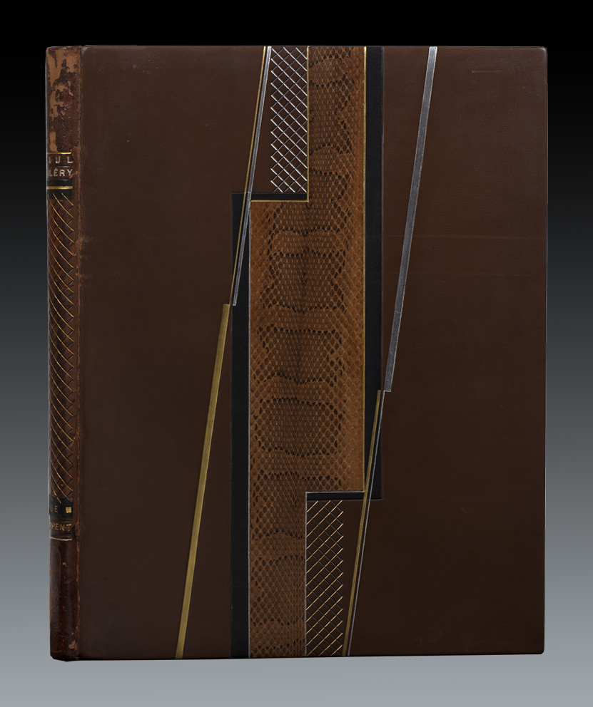
*Le Serpent*, by Paul Valéry [Paris, Eos, 1926]. Folio, bound in brown calfskin, featuring a geometric composition formed by a piece of snakeskin set in a mosaic style. The reference to snakeskin implies the use of exotic reptile leather—such as python or cobra—highly prized for the natural pattern of its scales and texture; here, the term *mosaïquée* (mosaic-style) indicates that the snakeskin was not used as a single strip but was cut into small fragments and meticulously combined to create geometric patterns, blend textures, or juxtapose color tones, much like a mosaic artwork. The word *sertie* (set/mounted) signifies that the piece of snakeskin is framed and firmly secured by a metal border—typically gold, silver, brass, or steel—using a technique akin to the setting of gemstones in jewelry. This is the first illustrated edition of the work, which originated from the short poem *Chanson d’un serpent* (Song of a Serpent) written by Paul Valéry for his friend Pierre Louÿs. It is illustrated with 15 original lithographs by Jean Marchand, as well as 24 headpieces and 7 tailpieces drawn and engraved by Sonia Lewitska. The print run was limited to 230 copies; this is one of 169 copies on Van Gelder Holland paper, signed by both the author and the publisher, and includes two additional suites of the illustrations. The copy bears a signed inscription by the author on the first flyleaf: "Exemplaire de M. Alexandre E. Shaw. Paul Valéry."

Portrait of Alexander E. Shaw. Photography: Courtesy of Buenos Aires Rowing Club.
Alejandro Shaw financed and promoted catalogs on French art such as the Exhibition The French Book, held from July 1 to August 30, 1939 at the National Museum of Fine Arts in which he participated along with other collectors [10]. It was an important international cultural event organized in parallel to the great exhibition of French painting [French Painting: from David to the present day].
His legacy
Alejandro Shaw died in Buenos Aires on October 30, 1970 at the age of 77. The destiny of many of his masterpieces was the enrichment of Argentine public heritage. After his death, the pieces were dispersed through family legacies and donations from his heirs. The clearest example of this occurred in 1977, when Zurbarán's emblematic painting entered definitively ex donation to the National Museum of Fine Arts in Buenos Aires through his legacy, where today it is permanently exhibited as one of the treasures of the European art gallery.
Notes:
1] Enrique Ernesto Shaw, first a Navy officer and then an industrialist, founder of the Christian Association of Business Leaders [ACDE], was a layman, father of a family [he married Cecilia Ana María Luisa Bunge Fourvell-Rigolleau (1921-2007) with whom he had 9 children], committed to making the Social Doctrine of the Church a reality in the world of work, he was declared Venerable Servant of God in 2021 by the Pope Francis, and on December 18, 2025, Pope Leo XIV authorizing the promulgation of the decree on a miracle attributed to his intercession [the scientifically inexplicable healing of a seriously injured child] opened the way for his beatification by the Roman Catholic Apostolic Church.
2] Annuaire/de la/curiosité/des/Beaux –Arts/et de la/Bibliophilie/Fondé en 1911 par Francis Campbell/-/Paris-Départements-Étranger/1933 [...] Paris.
3] There are those who have dedicated their lives to bringing them together and there are many examples among us, but the one that has impressed me the most is the collection of Raphael Esmerian, one of the richest in bindings formed in the 20th century, whose catalog published in Paris in 1972-1974, consists of 5 parts in 6 volumes
4] Mel Byars, The Design Encyclopedia, London-New York, John Willey & Sons, 1994, p. 137.
5] Yves Peyré, Histoire de la reliure de création, Paris, Faton, 2015, p. 184.
6] Julien Fléty, Dictionnaire des relieurs français ayant exercé de 1800 à nos jours suivi d´une Guide pratique des relieurs, doreurs, marbreurs et restaurateurs contemporains, Paris, Editions Technorama, 1988, p. 111.
7] ALDE / Maison de ventes spécialisée/ Livres-Autographes-Monnaies/ Reliures originals/ Livres illustrés modernes /Vaente aux encheres Públicas/ Mercredi November 22, 2017 [...] Paris [...]
8] The term "vélin" [translated into Spanish as *papel vitela* or wove paper] refers to a type of high-quality paper that is completely smooth and uniform, lacking textured lines. It emerged in France around 1770 and transformed the worlds of graphic arts and luxury book publishing. Its name derives from the Latin *vellum* (meaning calf); it was named this because it mimicked the extreme smoothness and polished finish of luxury parchment originally made from the skin of unborn animals. To understand its value in art and printing, it is best compared directly to the traditional method of the era. Wove paper (*vélin* or *vitela*) is distinguished from laid paper (*verjurado* or *vergé*) by its manufacturing process: the former uses a metal mesh woven from extremely fine, tightly spaced copper wires acting as a smooth sieve, whereas the latter is made on a screen of parallel metal wires crossed by transverse wires. Regarding appearance and texture, wove paper has a completely smooth, uniform, and satin-like surface that shows no grid marks or transparency patterns when held against the light; in contrast, laid paper has a rougher surface with a texture of fine lines visible against the light [known as *puntizones* and *corondeles*]. Its importance in both modern and historical graphic arts lies in the fact that, being so smooth and uniform, wove paper offers exceptional ink absorption and great stability during repeated passes through printing presses. It is the preferred medium for artists and publishers for fine art printing techniques—such as lithography, screen printing, intaglio, and academic drawing—because it captures minute details without the paper's texture distorting the stroke or the printed image. Historic manufacturers such as Arches Papers or BFK Rives popularized this finish by using pure cotton or linen pulp, turning books printed on *vélin* paper into prized collector's items for bibliophiles.
9] cf. Christian Galantaris, *Manuel de Bibliophilie. Dictionnaire suivi d´observations sur la Bibliographie et d´une Bibliographie Sélective*, Paris, Éditions des Cendres, 1997, p. 121.
10] "Exhibitions / of / French Art / II / The French Book /-/ The Museum of Literature / Book Illustrators / The Louvre Calcography /-/ July-August / 1939 /-/ National Museum of Fine Arts / Buenos Aires." Foreword in French by Paul Valéry; a 126-page volume. Contents: Museum of Literature; Foreword by Paul Valéry (in French); Introduction by Julien Cain; Three 19th-century French writers: Honoré de Balzac (presented by Marcel Bouteron), Gustave Flaubert (presented by René Dumesnil and Armand Dorville), and Charles Baudelaire (presented by Yves Gérard Le Dantec); Book illustrators; Bindings and books; Exhibition of the French book; and The Calcography of the Louvre Museum. This was Volume 2 of the French Art Exhibitions series.
* Special for Hilario. Arts, Letters, and Crafts.